Thursday, February 12, 2009

3M coat hook for...Kids?


I don´t see such hilarious things like this very often, and when I see them, I don´t usually make a blog post about them but I just couldn´t contain my smart, willing fingers this time.
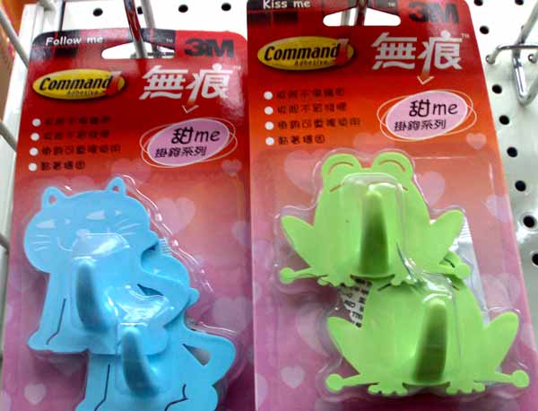
3M is a cool company. I really enjoy playing with their high-tech tapes and gummy stuff but I´m not sure if I would actually buy one of this, specially because they look like they are made for kids and I guess my inner kid wouldn´t dig it anyway.
I´m trying to decipher why a huge company like them would release such a controversial product on the market, but the more I try, the more confuse I get.
By the way, did you guys noticed that little message written on the top-right corner of their packages? What the F**** is that?
What a crazy world dude...

[Via Texyt]

Wednesday, February 11, 2009

Another simple and great idea


Here is the econfont, dude.
It´s looks pretty weird in this big size, but in a regular 10 or 12px size, those small holes wouldn´t even appear anyway.
If you haven´t concluded it yet, it´s main goal is to save more ink by not printing this small holes. Pretty smart, ha?
According to their creators, it saves more than 20% of ink in a regular office environment if compared to the other conventional fonts.
For me, this solution is much better than using that terrible "economic" printing mode, which grays up the text and make it almost unreadable.
And the better : It´s free!! So why don´t you, dear eco-reader, go dowload it and start using it in your office? I did!

[Via Unpressable Buttons]

Kicker behaviorist design. Literally.


Here´s an ass kicker functional design guys.
I just think they could improve the materials a little bit.Maybe take off this raw wood, give it some color and add a more aesthetically pleasant look.
In my humble opinion, It would look much better if it really looked like a small bench, which would also add some extra function to it.
It would also look fantastic if it was embedded into the wall, near the entrance door of a house, so you could just kick of your shoes and keep your home clear of those damned germs and stuff.
It´s a lovely idea anyway, and it´s clearly inspired by people´s natural behavior.
I don´t know in fact who designed it and I couldn´t track them down, but if one of you know, please, drop me a note.

[Via Swiss Miss]

Tuesday, February 10, 2009

Another classic "inspiration" case.

Do you guys remember that "Dining in 2015" design competition, organized by Design Boom, in 2008, right?
Well, one of the three ex quo winners, was the Din-Ink project, made by Andrea Cingoli, Paolo Emilio Bellisario, Cristian Cellini and Francesca Fontan, from Italy.
Here is a pick of the project:
While I was browsing some websites a few months ago, I found this very interesting design website called Book of Joe, where two guys from Ireland were really mad about Design Boom´s competition results. James Rennick and Simon Kingston, were claiming to be the original designers and creators of the bic cutlery concept, in 2006.
Looks pretty similar to me indeed.
Here it is:
I´ve just found out that another guy called Pierre Haulot, designed a very similar concept in 2007, in which you can take a look at Trends Now website.
Here it is:

Dear reader, you can take this investigation further if you wish, but for me is very clear that the Din-Ink project, which won the Design Boom´s contest, is very far from being an original design project.
I just can´t understand why a great website like Design Boom didn´t do nothing about this terrible injustice.
As far as I now, James Rennick and Simon Kingston, who seem to be the original designers, have contacted Design Boom´s team to claim for their copyrights, with absolutely no success.
Here are James Rennick words about this incident:

What year did you design the Bic Biro cutlery pictured on your Coroflot page?

"I did them over a year ago and they have been knocking around on the internet for about the same time. My portfolio has been linked to many blogs during that time. I find it very fishy since from the whole angle they have on their design when googled ( for example, during the research stage) one would quickly come across links to my portfolio with the "Miele Project" .I contacted Design Boom but nothing can really be done about this and my boss agreed also. I am pretty pissed but I shall get over it. A learning curve I guess."

It´s up to you to judge my friend, but this case is very clear to me. I guess no one really cares about originality.

Monday, February 9, 2009

Some people call it inspiration...

Well, I always spend almost 2 hours of my day researching about design and I see things like this happening very often, unfortunately.
I remember when the first flat packed dining kit was launched by Jason Amendolara at Worldwide Fred. It´s a very cool design, I really love it and it´s an original idea as far as I know.
By that time, It was published in almost every design related blog and website of the world.
Here´s a picture of it:

Some time later, a girl called Demelza Hill, who used to work with Tom Dixon, appeared with this design:

Again, a few months later, another guy called Ed Vince launched the most original dinning kit ever:


Now, I´ve just found another one, designed by Ian Jones. Here it is:


Does anyone care about originality?
Why someone would spent time and effort designing something that already exists?
Just a short advice to all designers : Do your job like it´s supposed to be done. Do a deep research before spreading your designs over the internet, claiming them to be the most original stuff ever. Or even better, do this research at the conceptual stage of the project, so you don´t even waste your time and money taking "your" idea to the prototype and production stages.
But if you know you´re just a copycat and can live with that...Shame on you.
If you can´t create, why don´t you just quit?